

Fluenta
Naming and identity for online English language school
The online English language school turned to LINII to develop its name and identity. The School's target audience is mainly young people, so the brand image had to be modern and stylish. The proposed name Fluenta evokes associations with fluency in the language.
Fluenta, like a guiding star, will always point you in the right direction in learning a foreign language. The slogan "The stars are closer than it seems" is a beautiful reminder that school helps the students to "reach for the stars". The company believes that the result of studying English is not just speech skills, knowledge of grammar and vocabulary of the language. It is also a special attitude, a more global vision of the world, ambitious goals and opportunities to achieve them.
The company had been successfully teaching the language offline for more than 12 years. Since then, the name of the school has not changed and it has been retained for the full-time course in the present period. For the online project the team considered it cumbersome, not comprehensive in terms of development prospects, and not reflecting their «matured» values.
When searching for a reliable partner for naming development, the main criteria were specialization in naming, solid positive experience, expertise, high level of competencies and communication of company employees.

Nadezhda Marina, CEO of Fluenta quotes: "The decision to entrust the development of the name to LINII was definitely the right one. We are grateful to LINII for its thoughtful approach and responsiveness; the team was always ready to help, discuss, and analyze.
We are happy and proud to be called Fluenta. It reflects the professional level of the team — language fluency, fluent English".
The slogan is reflected in the star-shaped logo. The star shape was made a style-forming element and part of the corporate pattern. Thanks to this solution, the Fluent identity is very flexible and scalable to any media.
The stars are much closer than it seems when you know exactly how to get to them. When there is a faithful assistant who is nearby every second and who will always tell you in which direction to move. Learning English is easy with Fluenta.

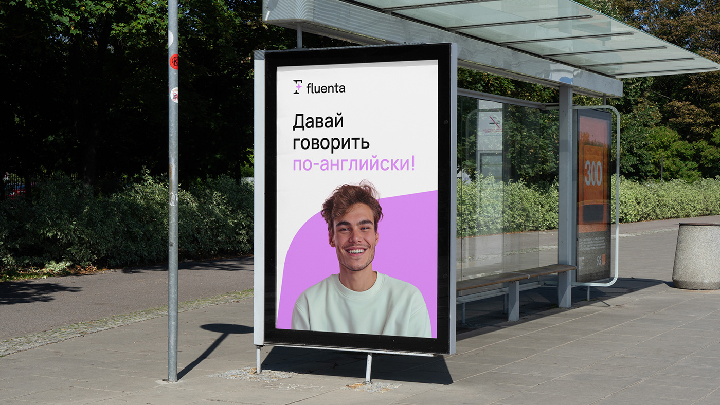
The color palette of mint and neon pink looks very modern and fresh. Studio photos of young people combined with rounded elements of the corporate identity give the brand dynamics and tempo.


Project team:
Mikhail Gubergrits — CEO
Taisiya Denisova — Executive Director
Valeria Lyakutkina, Christina Andranaki — Project Managers
Elena Ilyina — Naming Director
Alena Gorbacheva — Art Director
Anna Kamenkova — Designer
Kirill Zharkoy — Case Study Art Director
Anton Andreev — Case Study Designer
Anton Andreev — Case Study Designer


